i sub-taught for my buddy
Rad's figure invention class tonight. i went over character design & storyboarding . i also demo'd some tips for breaking scripts down visually , conveying mood through staging and perspective , and also a short talk on facial expressions & posing . i also looked over their assignments and gave some portfolio tips .
its awesome to see so many people coming into art , and from around the world too there were a couple people there from out of the US working in animation and comics ! it was definitely a talented group :)
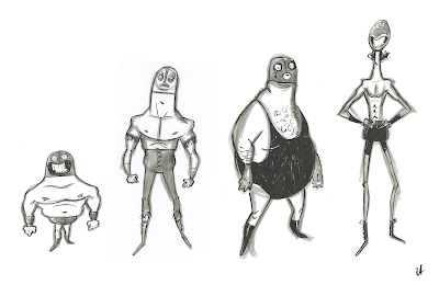
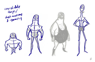
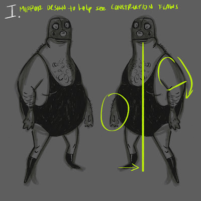
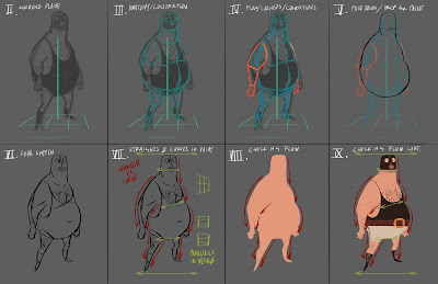
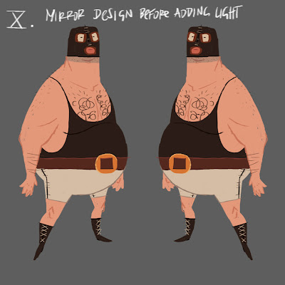
here was the character demo i prepared for them:



15 comments:
this guy is dope, wish I was there to catch the demo..
Lovely step by step. Nice to see when people have a similar approach to you and youve not been doing it wrong all this time!
Great character, I love his gimp face and curly chest!
Great stuff, thanks for sharing !
This is awesome man, wish i had a class like this while i was in school. Great characters too!
Awesome! I never flip as much as I should but you've made me see the light! Thanks for sharing with everyone who couldn't be there too, any chance we could get you to share the storyboarding secrets as well ;)
It's great seeing the process work, and the final is awesome :D
what a badass... teach me something!
Nice! Sounds like you had fun. :] and that final wrestler dude is sweet
So cool to see some process. You're a freaking mad man.
Nice wrestler, professor Abando!
Thanks so much for teaching our class on Sunday! It was really great meeting you and seeing your work, and hearing about your thinking/designing process. Learned a lot that day, and I'll be following your blog from now on! :)
Thanks for demo-ing for us dude, I've been following your blog and it was cool to finally meet you. You should consider teaching!
what was the construction flaw? I don't really get it.
@brian- initially my designs/ sketches are better for getting the idea across, so i may not be as specific in my first pass. in this case, i saw two flaws in my initial design. first, i saw his center of gravity needed to be clarified by bringing in his legs a bit more to better support his large frame. secondly, the construction/ placement of his arms felt incorrect to me. between steps iii. and v. i took a more anatomical approach with the stylized design, and corrected how/where the arms connected to the body
Wow! Thanks for all the help and advice Ian! :)
Post a Comment